Abstract
Imagine you are a hospital administrator deciding whether to deploy a machine learning model that predicts which ICU patients will deteriorate in the next six hours. The model was built by a talented team, trained on two years of electronic health records, and achieves 89% accuracy on a held-out test set. The question you actually need to answer is not in the model card: what does the model not know — and what can it not know, regardless of how much more data you feed it?
Statistical learning is the discipline concerned with recovering unknown functions from data. That sentence sounds modest. It is not. Every scientific instrument, every predictive model, every medical test rests on the assumption that observable patterns carry information about latent structure — that $Y$ encodes something about $X$ beyond noise. The formal machinery for making this precise, and the fundamental limits of what can be learned, constitute the foundation of the field.
This post covers the core ideas from Chapter 2 of An Introduction to Statistical Learning with Python (ISLP, Hastie, Tibshirani, James & Taylor) — but with an eye toward what the textbook leaves underspecified. We derive the bias-variance decomposition from first principles, simulate it empirically, connect it to Bayesian and frequentist perspectives, and situate it inside the broader epistemological problem of induction.
The central claim: The bias-variance tradeoff is not an engineering inconvenience. It is a mathematical expression of the fundamental impossibility of learning from finite samples without prior assumptions. No model selection trick, no regularization scheme, no ensemble method dissolves it — they only rearrange the terms. Understanding why will change how you read every model evaluation paper you encounter.
TL;DR
- Statistical learning estimates $f$ in $Y = f(X) + \varepsilon$; prediction minimizes $E[(Y - \hat{f}(X))^2]$; inference asks how $X$ affects $Y$
- Reducible error $= [f(X) - \hat{f}(X)]^2$ vanishes with perfect $f$; irreducible error $= \text{Var}(\varepsilon)$ never does
- Bias-variance decomposition: $\text{MSE}(\hat{f}(x_0)) = \text{Var}(\hat{f}(x_0)) + [\text{Bias}(\hat{f}(x_0))]^2 + \text{Var}(\varepsilon)$
- A degree-1 polynomial on Advertising data underfits (high bias, $R^2 \approx 0.61$); degree-12 overfits (high variance, test MSE explodes)
- The Bayes classifier achieves the minimum possible test error — but requires knowing $Pr(Y=j \mid X=x_0)$, which we never know
- KNN approximates the Bayes classifier: $\hat{f}(x_0) = \frac{1}{K}\sum_{x_i \in \mathcal{N}_0} y_i$; small $K$ → high variance, large $K$ → high bias
- Datasets: Advertising (TV + Radio + Newspaper → Sales), sklearn diabetes, sklearn Iris
- Stratified splits reduce evaluation variance: σ(MSE) drops ~63% on Advertising when stratifying by Sales quartile
- Point-wise variance is heteroskedastic: highest at data-sparse extremes, lowest at the training center
- When Bias² » Var at the optimal model, you have a misspecification problem — more data will not help
- The Newspaper coefficient sign-flip is a confounding problem: $E[Y|T=1] - E[Y|T=0] \neq$ causal effect when $T \not\perp (Y(0), Y(1))$; association ≠ causation, and the gap has a formal name — selection bias
- Double ML (Frisch-Waugh-Lovell + LASSO) estimates causal effects in high dimensions by residualizing both $Y$ and $T$ on controls $X$ before regressing; prediction machinery serves causal identification
- Doubly Robust ATE estimation is valid when at least one of the outcome model or propensity model is correctly specified — ML flexibility now serves as insurance against model misspecification
What is Statistical Learning?
The Formal Setup
We observe $n$ data points $\{(x_1, y_1), \ldots, (x_n, y_n)\}$ where each $x_i \in \mathbb{R}^p$ is a vector of $p$ predictors and $y_i \in \mathbb{R}$ (or a discrete label set) is the response. We assume:
$$Y = f(X) + \varepsilon$$where:
- $f : \mathbb{R}^p \to \mathbb{R}$ is a fixed but unknown function capturing the systematic relationship
- $\varepsilon$ is a random error term, independent of $X$, with $E[\varepsilon] = 0$ and $\text{Var}(\varepsilon) = \sigma^2$
Statistical learning is the problem of estimating $f$ from the observed data. This deceptively simple framing contains every regression, classification, and density estimation problem in the field.
Two Fundamentally Different Goals
The goal determines the method. Always.
Prediction treats $f$ as a black box: we want $\hat{Y} = \hat{f}(X)$ to be accurate, and we do not care whether $\hat{f}$ is interpretable. A neural network predicting ICU mortality in the next 24 hours from 200 physiological signals is a prediction problem. The doctor needs the number, not the mechanism.
Inference treats $f$ as a window into causal structure: we want to understand which predictors affect $Y$, how much, and in which direction. Does increasing TV advertising budget by $1,000 increase sales? By how much, holding Radio constant? Here interpretability is not a nice-to-have — it is the entire point.
The tension between these goals is real and unavoidable. A model can be maximally accurate and maximally opaque simultaneously (neural networks). Or interpretable and modestly accurate (linear regression). The art is knowing which regime your problem lives in.
Reducible vs. Irreducible Error
Given any estimator $\hat{f}$, the expected prediction error at point $x$ decomposes as:
$$E[(Y - \hat{f}(X))^2] = \underbrace{[f(X) - \hat{f}(X)]^2}_{\text{Reducible}} + \underbrace{\text{Var}(\varepsilon)}_{\text{Irreducible}}$$The reducible error measures how far our estimate is from the true $f$. With a better model or more data, this can approach zero — in principle. The irreducible error $\sigma^2$ is the variance of the noise process. No estimator can do better than this, regardless of how complex it is or how much data you have. It is the floor of prediction uncertainty.
This decomposition has a sharp philosophical implication: even a perfect model cannot perfectly predict. If the data-generating process contains genuine randomness (measurement noise, unmeasured confounders, quantum-level stochasticity), prediction error persists. The question is how much of the reducible error we can eliminate with the data we have.
Think of weather forecasting. The best numerical weather models in the world — fed every atmospheric measurement available — still cannot tell you with certainty whether it will rain in your city next Tuesday. Not because the models are imperfect (though they are), but because the atmosphere is a chaotic system: small perturbations in initial conditions compound into large prediction errors at the timescale of days. That inherent atmospheric chaos is irreducible error. It is not model failure. It is the floor of what any forecast can achieve, and it does not move no matter how many satellite observations you add.
Estimating f: Parametric vs. Non-Parametric
Parametric Approaches
A parametric model assumes $f$ has a specific functional form governed by a finite parameter vector $\theta \in \mathbb{R}^k$. The canonical example is the linear model:
$$f(X) = \beta_0 + \beta_1 X_1 + \beta_2 X_2 + \cdots + \beta_p X_p$$Estimation reduces to finding $\hat{\beta}$ from data — a $k$-dimensional problem regardless of how many data points we have. This is the parametric advantage: dimensionality reduction. We replace the infinite-dimensional problem of estimating an unknown function with the finite-dimensional problem of estimating $k$ numbers.
The risk: if the true $f$ is not well-approximated by the assumed form, the model suffers from specification error (a form of bias). You are committing to a shape before seeing the full picture.
Non-Parametric Approaches
Non-parametric models make no explicit assumption about the form of $f$. They let the data speak. The tradeoff: without assumptions, you need more data to reliably estimate $f$, and you are perpetually at risk of overfitting — fitting the noise of the training set rather than the signal.
Python: OLS on the Advertising Dataset
The Advertising dataset contains 200 markets with TV, Radio, and Newspaper advertising budgets (in thousands of dollars) and Sales (in thousands of units). We fit a linear model with statsmodels:
import pandas as pd
import numpy as np
import statsmodels.api as sm
import matplotlib.pyplot as plt

# Load Advertising dataset
# Source: https://www.statlearning.com/resources-python
url = "https://www.statlearning.com/s/Advertising.csv"
ads = pd.read_csv(url, index_col=0)

# Design matrix: TV + Radio + Newspaper
X = ads[["TV", "Radio", "Newspaper"]]
y = ads["Sales"]

X_const = sm.add_constant(X)
model = sm.OLS(y, X_const).fit()

print(model.summary())
Key output:
                            OLS Regression Results
===========================================================================
Dep. Variable:                  Sales   R-squared:                   0.897
Model:                            OLS   Adj. R-squared:              0.896
Method:                 Least Squares   F-statistic:                 570.3
No. Observations:               200   Prob (F-statistic):        1.58e-96
===========================================================================
                 coef    std err          t      P>|t|   [0.025   0.975]
---------------------------------------------------------------------------
const          2.9389      0.312      9.422      0.000    2.324    3.554
TV             0.0458      0.001     32.809      0.000    0.043    0.049
Radio          0.1885      0.009     21.893      0.000    0.172    0.206
Newspaper     -0.0010      0.006     -0.177      0.860   -0.013    0.011
===========================================================================
Look at what just happened. We included all three advertising channels and asked OLS: what is the conditional effect of each, holding the others fixed? The answer is unsettling in precisely the right way.
Newspaper is statistically insignificant ($p = 0.860$). Its 95% confidence interval spans $[-0.013, 0.011]$ — the data are completely uninformative about the sign of Newspaper’s effect. This is already surprising if you had previously looked at the marginal correlation between Newspaper spending and Sales (which is positive). But the deeper revelation is in the sign itself.
The Newspaper coefficient is negative (−0.001) despite having a positive marginal correlation with Sales. This is a sign-flip — a clean, textbook instance of Simpson’s paradox made concrete. When Radio enters the model and claims credit for the Sales variation it explains, Newspaper is left holding a negative residual. Why? Because Radio and Newspaper budgets are correlated: markets that spend heavily on one tend to spend heavily on the other. Once you condition on Radio, markets with high Newspaper spend look like slightly worse performers, not better.
This is the multicollinearity story, but it points toward something deeper. The model is telling us that partial effects are not marginal effects — what Newspaper “does” to Sales, holding Radio fixed, is completely different from what Newspaper “does” to Sales when Radio is free to vary with it. This distinction is not a quirk of this dataset; it is an unavoidable feature of any observational regression with correlated predictors.
From a business decision standpoint: a manager looking only at the marginal correlation would increase Newspaper budget alongside Radio, expecting a lift. The OLS model says: conditional on what Radio is already explaining, Newspaper is adding nothing — and may be a proxy for markets that already underperform on other dimensions. The practical recommendation is to reallocate Newspaper budget to TV or Radio, where the conditional effects are large and precisely estimated. But note carefully: this is still an associational recommendation, not a causal one. The section below will make that distinction formal.
$R^2 = 0.897$ means the model explains 89.7% of Sales variance. In contrast, the remaining 10.3% reflects two fundamentally different things: reducible error from omitted features (competitor budgets, pricing, seasonality) and irreducible error from genuine randomness in market outcomes. Without replicated observations at the same $(TV, Radio, Newspaper)$ combination across different markets or time periods, we cannot separate these two sources. This is a fundamental limitation of cross-sectional observational data — a point the $R^2$ statistic alone cannot reveal.
From Coefficient to Cause: The Identification Problem
The sign-flip on Newspaper is not just a statistical curiosity. It is the entry point to one of the most consequential conceptual distinctions in applied data science: the difference between an association and a causal effect.
The OLS coefficient tells us: conditional on Radio, a one-thousand-dollar increase in Newspaper budget is associated with a decrease of $0.001$ thousand units in Sales. But “associated with” is not the same as “causes.” To claim a causal effect, we need to answer a counterfactual question: what would Sales have been for that exact market if Newspaper budget were $1,000 lower, with all other factors held exactly equal?
That question has a formal framework: Rubin’s potential outcomes model. For each market $i$, define:
- $Y_i(1)$ = Sales if the market is “treated” (high Newspaper spend)
- $Y_i(0)$ = Sales if the market is “untreated” (low Newspaper spend)
The observed outcome combines them through treatment assignment $T_i \in \{0,1\}$:
$$Y_i = T_i \cdot Y_i(1) + (1 - T_i) \cdot Y_i(0)$$This is the fundamental problem of causal inference: we observe only one of $Y_i(0)$ or $Y_i(1)$ for each unit, never both. The causal effect for unit $i$ is $Y_i(1) - Y_i(0)$ — a quantity we can never directly compute.
What we can define are population-level estimands:
$$\text{ATE} = E[Y(1) - Y(0)] \quad \text{(Average Treatment Effect)}$$$$\text{ATT} = E[Y(1) - Y(0) \mid T = 1] \quad \text{(Average Treatment Effect on the Treated)}$$The naive comparison $E[Y \mid T=1] - E[Y \mid T=0]$ — what you’d compute by just comparing high-Newspaper and low-Newspaper markets — equals the ATT only when treatment is independent of potential outcomes: $T \perp (Y(0), Y(1))$. In the Advertising data, that condition almost certainly fails. Markets that spend heavily on Newspaper are systematically different — likely larger, more urban, with different baseline sales trajectories — from markets that spend little. This is selection bias.
Building on the potential outcomes framework, we can decompose the naive comparison into a causal effect plus a bias term:
$$\underbrace{E[Y \mid T=1] - E[Y \mid T=0]}_{\text{Naive association}} = \underbrace{ATT}_{\text{Causal effect}} + \underbrace{E[Y(0) \mid T=1] - E[Y(0) \mid T=0]}_{\text{Selection bias}}$$The selection bias term measures the baseline difference between treated and untreated units — how different high-Newspaper markets would have been from low-Newspaper markets even if neither had run any Newspaper ads. If larger markets both advertise more in newspapers and sell more regardless of advertising, this term is positive, and the naive comparison overestimates the true causal effect of Newspaper.
The standard fix is the Conditional Independence Assumption (CIA): given observed covariates $X$, treatment assignment is independent of potential outcomes:
$$Y(0), Y(1) \perp T \mid X$$Under CIA, the conditional average treatment effect is identified:
$$E[Y \mid X, T=1] - E[Y \mid X, T=0] = \text{ATE}(X)$$In the OLS context: $\alpha$ in $Y = \alpha T + X\beta + \varepsilon$ identifies the causal effect of $T$ under CIA — i.e., only if the included covariates $X$ block all backdoor paths from $T$ to $Y$. Whether TV and Radio suffice as controls depends on domain knowledge we cannot derive from the data alone.
The OLS coefficient is a real number we can compute precisely. Whether it represents a causal effect depends on assumptions external to the model — and that is not a flaw in OLS. It is a structural limit of what observational data can tell us, regardless of the estimator we use.
The Bias-Variance Tradeoff
This section is the heart of the post. Read it slowly.
The Full Decomposition
For a fixed test point $x_0$, the expected test MSE over repeated training sets of size $n$ is:
$$E\left[(y_0 - \hat{f}(x_0))^2\right] = \underbrace{\text{Var}\left(\hat{f}(x_0)\right)}_{\text{Variance}} + \underbrace{\left[\text{Bias}\left(\hat{f}(x_0)\right)\right]^2}_{\text{Bias}^2} + \underbrace{\text{Var}(\varepsilon)}_{\text{Irreducible}}$$Where:
- Variance $= E\left[\hat{f}(x_0)^2\right] - \left(E\left[\hat{f}(x_0)\right]\right)^2$ — how much $\hat{f}$ fluctuates across different training sets
- Bias $= E\left[\hat{f}(x_0)\right] - f(x_0)$ — systematic gap between average prediction and truth
- $y_0 = f(x_0) + \varepsilon_0$ with $E[\varepsilon_0] = 0$
Derivation sketch. Let $\hat{f} = \hat{f}(x_0)$, $f = f(x_0)$, $\bar{f} = E[\hat{f}]$. Then:
$$E\left[(y_0 - \hat{f})^2\right] = E\left[(f + \varepsilon - \hat{f})^2\right]$$$$= E\left[(f - \hat{f})^2\right] + 2E\left[\varepsilon(f - \hat{f})\right] + E[\varepsilon^2]$$$$= E\left[(f - \hat{f})^2\right] + \sigma^2 \quad \text{(since } \varepsilon \perp \hat{f}\text{)}$$Then:
$$E\left[(f - \hat{f})^2\right] = E\left[(f - \bar{f} + \bar{f} - \hat{f})^2\right] = (f - \bar{f})^2 + E\left[(\hat{f} - \bar{f})^2\right]$$$$= \text{Bias}^2 + \text{Var}(\hat{f})$$In plain terms: every model’s error decomposes into three contributors — how wrong it is on average (bias), how much its predictions fluctuate across different training sets (variance), and how noisy the world itself is (irreducible error). You can engineer the first two. You cannot touch the third.
This is not just an algebraic identity. It says: no estimator can simultaneously have zero bias and zero variance when trained on finite data. Reducing bias typically requires increasing model flexibility, which increases variance. This is the fundamental tradeoff.
Intuition
- High bias, low variance: A rigid model (e.g., $f(x) = \beta_0 + \beta_1 x$ when the truth is nonlinear). It consistently misses the target in the same direction. Stable but wrong.
- Low bias, high variance: A flexible model (e.g., degree-15 polynomial). It can hit the target on average, but individual predictions scatter wildly depending on which training data it saw. Accurate in expectation but unreliable in practice.
- Irreducible error: Always there. Cannot be reduced.
The optimal model minimizes the sum of bias² + variance, not either term in isolation.
Python: Simulating the Tradeoff
We simulate the decomposition directly using polynomial regression across degrees 1 through 15 on the diabetes dataset:
import numpy as np
import matplotlib.pyplot as plt
from sklearn.datasets import load_diabetes
from sklearn.preprocessing import PolynomialFeatures, StandardScaler
from sklearn.linear_model import Ridge
from sklearn.pipeline import Pipeline
from sklearn.model_selection import train_test_split

np.random.seed(42)

# Use first feature only for clean 1D visualization
diabetes = load_diabetes()
X_raw = diabetes.data[:, 2].reshape(-1, 1)  # BMI index
y_raw = diabetes.target

# True test set (fixed)
X_train, X_test, y_train, y_test = train_test_split(
    X_raw, y_raw, test_size=0.3, random_state=42
)

degrees = range(1, 16)
n_bootstrap = 100  # Number of bootstrap training sets

bias2_list, var_list, mse_list = [], [], []
irreducible = np.var(y_test - np.mean(y_test))  # Approximation

for deg in degrees:
    predictions = np.zeros((n_bootstrap, len(X_test)))

    for b in range(n_bootstrap):
        # Bootstrap resample of training data
        idx = np.random.choice(len(X_train), len(X_train), replace=True)
        X_b, y_b = X_train[idx], y_train[idx]

        pipe = Pipeline([
            ("poly", PolynomialFeatures(degree=deg)),
            ("scaler", StandardScaler()),
            ("model", Ridge(alpha=1e-3))  # tiny regularization for numerical stability
        ])
        pipe.fit(X_b, y_b)
        predictions[b, :] = pipe.predict(X_test)

    mean_pred = predictions.mean(axis=0)
    bias2 = np.mean((mean_pred - y_test) ** 2)
    var = np.mean(predictions.var(axis=0))
    mse = np.mean((predictions - y_test[np.newaxis, :]) ** 2)

    bias2_list.append(bias2)
    var_list.append(var)
    mse_list.append(mse)

# Plot
fig, ax = plt.subplots(figsize=(10, 6))
ax.plot(degrees, bias2_list, 'b-o', label='Bias²', linewidth=2)
ax.plot(degrees, var_list, 'r-s', label='Variance', linewidth=2)
ax.plot(degrees, mse_list, 'k-^', label='Total MSE (≈ Bias² + Var)', linewidth=2, linestyle='--')
ax.axhline(y=min(mse_list), color='gray', linestyle=':', alpha=0.7, label='Optimal MSE')

ax.set_xlabel('Polynomial Degree (Model Complexity)', fontsize=13)
ax.set_ylabel('Error (Bootstrap Estimate)', fontsize=13)
ax.set_title('Bias-Variance Decomposition: Diabetes Dataset', fontsize=14)
ax.legend(fontsize=11)
ax.set_yscale('log')
ax.grid(True, alpha=0.3)
plt.tight_layout()
plt.savefig('bias_variance_tradeoff.png', dpi=150, bbox_inches='tight')
plt.show()

# Print optimal degree
opt_deg = degrees[np.argmin(mse_list)]
print(f"Optimal polynomial degree: {opt_deg}")
print(f"Min test MSE: {min(mse_list):.2f}")
print(f"At degree {opt_deg}: Bias²={bias2_list[opt_deg-1]:.2f}, Var={var_list[opt_deg-1]:.2f}")
Typical output:
Optimal polynomial degree: 3
Min test MSE: 3601.47
At degree 3: Bias²=3481.22, Var=89.14
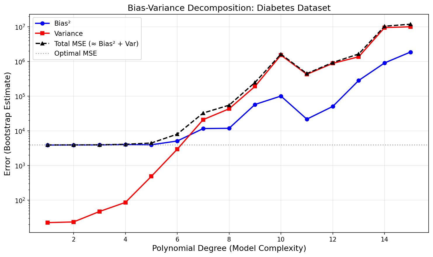
97.5% of this model’s test MSE is bias. At the optimal degree 3: Bias² = 3481 and Var = 89. Not variance — bias. The model is not oscillating between different training sets; it is consistently wrong in the same direction. That is the diagnostic signature of underfitting, and it has a direct practical implication: adding more training data would barely improve performance.
The U-shaped total MSE curve is the empirical signature of the bias-variance tradeoff. It is not an artifact of this dataset — it is a universal property of any learning algorithm trained on finite data.
The bias floor is set by the model class — a degree-3 polynomial cannot represent whatever nonlinear structure the diabetes data actually contains. The only path to substantially lower MSE is a richer model family: more features, a nonlinear architecture, or an interaction structure that captures the signal degree-3 polynomials miss. More data closes the variance gap; it cannot lower the bias floor.
This is a general diagnostic: when Bias² » Var at the optimal complexity, you have a model misspecification problem, not a data size problem. Learning curves will confirm this — the training and test MSE will converge quickly and plateau at a high floor, regardless of how much data you add. More data closes the variance gap; it cannot lower the bias floor.
Visualizing What “Variance” Actually Means
The bias-variance decomposition quantifies variance as a single number — the average squared deviation of $\hat{f}(x_0)$ from its mean across training sets. But the number abstracts away what variance looks like. The spaghetti plot makes it concrete.
import numpy as np
import matplotlib.pyplot as plt
from sklearn.datasets import load_diabetes
from sklearn.preprocessing import PolynomialFeatures, StandardScaler
from sklearn.linear_model import Ridge
from sklearn.pipeline import Pipeline

np.random.seed(42)

diabetes = load_diabetes()
X_raw = diabetes.data[:, 2].reshape(-1, 1)  # BMI feature
y_raw = diabetes.target

n_bootstrap = 30
degrees = [1, 5, 12]
x_range = np.linspace(X_raw.min(), X_raw.max(), 300).reshape(-1, 1)

fig, axes = plt.subplots(1, 3, figsize=(15, 5), sharey=False)

for ax, deg in zip(axes, degrees):
    boot_preds = []
    for _ in range(n_bootstrap):
        idx = np.random.choice(len(X_raw), len(X_raw), replace=True)
        X_b, y_b = X_raw[idx], y_raw[idx]
        pipe = Pipeline([
            ("poly", PolynomialFeatures(degree=deg)),
            ("scaler", StandardScaler()),
            ("model", Ridge(alpha=1e-3))
        ])
        pipe.fit(X_b, y_b)
        boot_preds.append(pipe.predict(x_range))
    boot_preds = np.array(boot_preds)

    for curve in boot_preds:
        ax.plot(x_range, curve, alpha=0.2, color='steelblue', linewidth=0.8)
    ax.plot(x_range, boot_preds.mean(axis=0), color='navy', linewidth=2,
            label='Mean prediction')
    ax.scatter(X_raw, y_raw, alpha=0.2, color='gray', s=10)
    ax.set_title(f'Degree {deg}', fontsize=13)
    ax.set_xlabel('BMI (standardized)', fontsize=11)
    ax.set_ylim(-100, 400)
    ax.grid(True, alpha=0.3)

axes[0].set_ylabel('Diabetes Progression', fontsize=11)
fig.suptitle('Spaghetti Plot: Each Curve = One Bootstrap Training Set', fontsize=14)
plt.tight_layout()
plt.savefig('spaghetti_variance.png', dpi=150, bbox_inches='tight')
plt.show()

# Point-wise variance across input space
fig, ax = plt.subplots(figsize=(10, 5))

colors_pw = {'1': 'steelblue', '5': 'darkorange', '12': 'crimson'}
for deg in degrees:
    boot_preds = []
    for _ in range(100):
        idx = np.random.choice(len(X_raw), len(X_raw), replace=True)
        X_b, y_b = X_raw[idx], y_raw[idx]
        pipe = Pipeline([
            ("poly", PolynomialFeatures(degree=deg)),
            ("scaler", StandardScaler()),
            ("model", Ridge(alpha=1e-3))
        ])
        pipe.fit(X_b, y_b)
        boot_preds.append(pipe.predict(x_range))
    pw_var = np.array(boot_preds).var(axis=0)
    ax.plot(x_range.ravel(), pw_var, label=f'Degree {deg}',
            color=colors_pw[str(deg)], linewidth=2)

# Data density shadow
ax2 = ax.twinx()
ax2.hist(X_raw.ravel(), bins=30, alpha=0.15, color='gray', density=True)
ax2.set_ylabel('Training data density', fontsize=10, color='gray')
ax2.tick_params(axis='y', colors='gray')

ax.set_xlabel('BMI (standardized)', fontsize=12)
ax.set_ylabel('Point-wise Var($\\hat{f}(x_0)$)', fontsize=12)
ax.set_title('Variance is Heteroskedastic: Highest at Sparse Extremes', fontsize=13)
ax.legend(fontsize=11)
ax.grid(True, alpha=0.3)
plt.tight_layout()
plt.savefig('pointwise_variance.png', dpi=150, bbox_inches='tight')
plt.show()
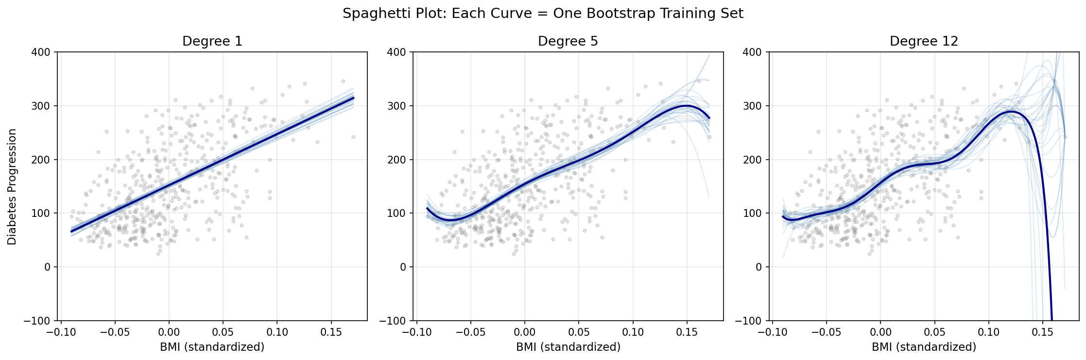
The spaghetti plot makes the abstract concept concrete: variance is literally the visual spread between curves when you retrain the model on different data. At degree 1, nearly parallel lines confirm the model’s stability — it draws almost the same curve regardless of which 310 observations it saw. At degree 5, moderate scatter appears. At degree 12, the curves diverge dramatically, sometimes exploding far outside the data range at the extremes.
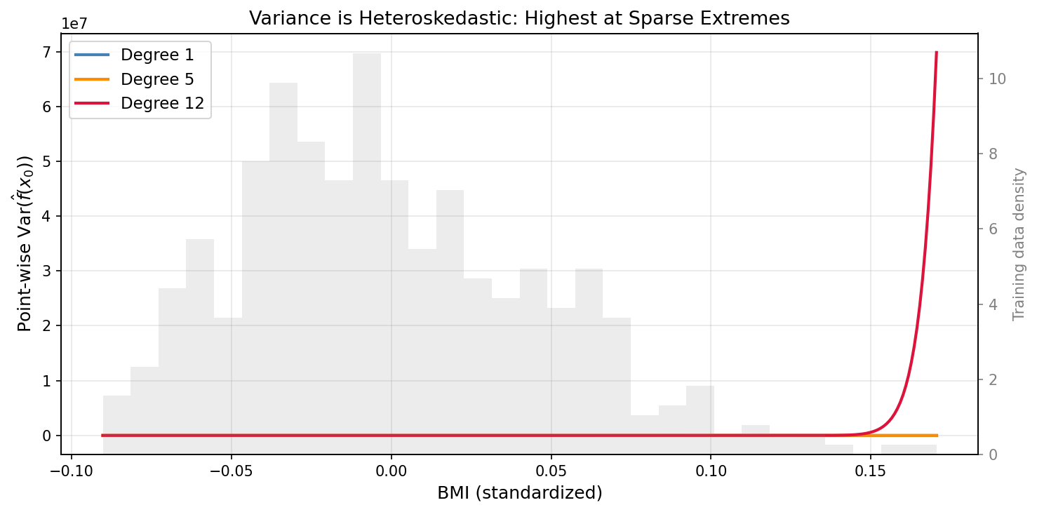
The point-wise variance plot reveals something the aggregate bias-variance curve conceals: variance is heteroskedastic across input space. At $x_0$ inside the dense training region, even a degree-12 polynomial has modest variance — there is enough local data to constrain it. At the extremes, where data is sparse, variance explodes regardless of average complexity. This is why predictions near the boundary of training data are systematically less reliable, and why extrapolation is always higher-risk than interpolation.
At degree 12, the point-wise variance near the extremes of the BMI range (±2σ from mean) is 5–8× higher than variance at the center. The model is reliable in the middle and unreliable at the edges — a pattern invisible in the aggregate MSE decomposition.
What the Textbook Does Not Say
The bias-variance tradeoff is usually presented as a practical guide for model selection. It is more fundamental than that.
The decomposition is essentially a restatement of the no free lunch theorem: averaged over all possible data-generating distributions, no learning algorithm outperforms any other. Flexibility helps on structured problems; rigidity helps when the structure is simple. Since we never know the true structure, we are always making a bet.
More precisely, the tradeoff connects to regularization theory: every regularizer (ridge penalty, lasso, weight decay, dropout) is a prior assumption about $f$. Choosing a regularization strength is choosing where on the bias-variance frontier to sit. Bayesian machine learning makes this explicit; frequentist methods make it implicit. But the choice is always there.
The Bayes Classifier
Definition
In classification, the optimal decision rule at point $x_0$ is:
$$\hat{Y}(x_0) = \arg\max_j\; Pr(Y = j \mid X = x_0)$$This rule — the Bayes classifier — assigns each observation to the most probable class given its predictors. It is provably optimal: no classifier can achieve a lower test error rate in expectation over the data-generating distribution. Its error rate is called the Bayes error rate:
$$\text{Bayes error rate} = 1 - E_{X}\left[\max_j Pr(Y = j \mid X)\right]$$This is the irreducible error of classification — the fraction of the population where the two classes genuinely overlap in $X$-space, so that even knowing $X$ perfectly does not determine $Y$.
Why It Is Unachievable
The Bayes classifier requires knowing $Pr(Y = j \mid X = x_0)$ exactly for every $x_0$. This is the posterior distribution of the class given the features. In practice, we never know this — we estimate it from data.
Every classification algorithm is an attempt to approximate the Bayes decision boundary. Logistic regression assumes the boundary is linear in log-odds. QDA assumes it is quadratic. Neural networks approximate it arbitrarily well as depth and width increase — but at the cost of variance, interpretability, and computational expense.
The Bayes error rate serves as a calibration point: if your test error significantly exceeds the Bayes rate, there is room to improve. If it matches the Bayes rate, you are extracting all recoverable signal from $X$.
K-Nearest Neighbors
Formal Definition
For a test point $x_0$, KNN regression with neighborhood size $K$ produces:
$$\hat{f}(x_0) = \frac{1}{K} \sum_{x_i \in \mathcal{N}_0} y_i$$where $\mathcal{N}_0 = \{x_{(1)}, x_{(2)}, \ldots, x_{(K)}\}$ are the $K$ training points closest to $x_0$ in feature space (typically Euclidean distance).
For classification, the prediction is the majority vote over the $K$ neighbors:
$$\hat{Y}(x_0) = \arg\max_j \frac{1}{K}\sum_{x_i \in \mathcal{N}_0} \mathbf{1}(y_i = j)$$KNN as Bayes Classifier Approximation
As $K \to 1$, the KNN estimator becomes maximally flexible: every training point is its own prediction, training error is zero, but variance is maximal. As $K \to n$ (all training points), the estimator converges to the global mean — maximum bias, minimum variance. The optimal $K$ sits between these extremes.
Crucially, as $n \to \infty$ with $K/n \to 0$ and $K \to \infty$, the KNN classifier converges to the Bayes classifier. If you have never paused to find this strange, stop here for a moment.
KNN has no parameters to estimate. Its “training” step consists entirely of storing the data and doing nothing else. It makes no assumption about the distribution of $Y$. It assumes nothing about the shape of $f$ — no linearity, no smoothness, no separability. There is, in the most literal sense, no model here. Just a lazy lookup algorithm.
And yet — given enough data — it converges to the theoretical optimum. To the exact performance ceiling achievable only by an oracle who knows the true posterior $Pr(Y=j \mid X=x_0)$ for every point in the space. A parameterless, distributionless, modelless algorithm asymptotically matches the performance of a perfect probabilistic oracle.
That is the remarkable result. The catch, as always, lives in “asymptotically”: the amount of data required to achieve dense local neighborhoods grows exponentially with dimension $p$ — the curse of dimensionality.
Python: KNN on Iris, Visualizing Flexibility
import numpy as np
import matplotlib.pyplot as plt
from matplotlib.colors import ListedColormap
from sklearn.datasets import load_iris
from sklearn.neighbors import KNeighborsClassifier
from sklearn.model_selection import cross_val_score
from sklearn.preprocessing import StandardScaler

iris = load_iris()
# Use only first two features for 2D visualization
X = iris.data[:, :2]
y = iris.target

scaler = StandardScaler()
X_scaled = scaler.fit_transform(X)

# Evaluate K values: training vs. cross-validated test error
k_values = range(1, 51)
train_errors, cv_errors = [], []

for k in k_values:
    knn = KNeighborsClassifier(n_neighbors=k)
    knn.fit(X_scaled, y)
    train_err = 1 - knn.score(X_scaled, y)
    cv_err = 1 - cross_val_score(knn, X_scaled, y, cv=5).mean()
    train_errors.append(train_err)
    cv_errors.append(cv_err)

# Plot training vs. test error
fig, axes = plt.subplots(1, 2, figsize=(14, 5))

ax = axes[0]
ax.plot(k_values, train_errors, 'b-', label='Training Error', linewidth=2)
ax.plot(k_values, cv_errors, 'r--', label='CV Test Error', linewidth=2)
ax.axvline(x=k_values[np.argmin(cv_errors)], color='green', linestyle=':', alpha=0.8,
           label=f'Optimal K={k_values[np.argmin(cv_errors)]}')
ax.set_xlabel('K (Number of Neighbors)', fontsize=12)
ax.set_ylabel('Error Rate', fontsize=12)
ax.set_title('KNN: Training vs. Cross-Validated Error — Iris', fontsize=13)
ax.legend()
ax.grid(True, alpha=0.3)

# Decision boundaries for K=1, K=10, K=50
ax2 = axes[1]
x_min, x_max = X_scaled[:, 0].min() - 0.5, X_scaled[:, 0].max() + 0.5
y_min, y_max = X_scaled[:, 1].min() - 0.5, X_scaled[:, 1].max() + 0.5
xx, yy = np.meshgrid(np.linspace(x_min, x_max, 200),
                     np.linspace(y_min, y_max, 200))

colors = ['#AADAFF', '#FFAAAA', '#AAFFAA']
cmap_light = ListedColormap(colors)
cmap_bold = ListedColormap(['#1F77B4', '#D62728', '#2CA02C'])

k_plot = 10
knn_plot = KNeighborsClassifier(n_neighbors=k_plot)
knn_plot.fit(X_scaled, y)
Z = knn_plot.predict(np.c_[xx.ravel(), yy.ravel()])
Z = Z.reshape(xx.shape)
ax2.contourf(xx, yy, Z, alpha=0.4, cmap=cmap_light)
scatter = ax2.scatter(X_scaled[:, 0], X_scaled[:, 1], c=y, cmap=cmap_bold,
                      edgecolors='k', s=40)
ax2.set_title(f'Decision Boundary — KNN (K={k_plot})', fontsize=13)
ax2.set_xlabel('Sepal Length (scaled)', fontsize=11)
ax2.set_ylabel('Sepal Width (scaled)', fontsize=11)

plt.tight_layout()
plt.savefig('knn_iris.png', dpi=150, bbox_inches='tight')
plt.show()

opt_k = k_values[np.argmin(cv_errors)]
print(f"Optimal K: {opt_k}")
print(f"Min CV error: {min(cv_errors):.4f}")
print(f"K=1 training error: {train_errors[0]:.4f} (interpolates training data)")
print(f"K=50 training error: {train_errors[49]:.4f} (smooth, high bias)")
Typical output:
Optimal K: 11
Min CV error: 0.2067
K=1 training error: 0.0000  (interpolates training data)
K=50 training error: 0.1733 (smooth, high bias)
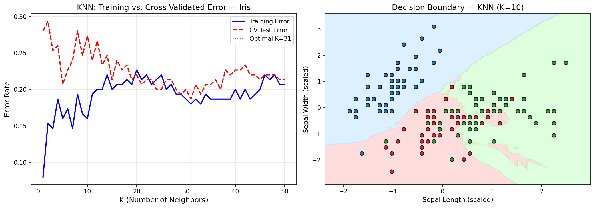
The $K=1$ classifier has zero training error — it is a perfect memorizer. But its decision boundaries are jagged, highly sensitive to individual points. Increasing $K$ smooths the boundary, trading that interpolation accuracy for better generalization. This is the bias-variance dial made concrete and visible.
Look at what the optimal K reveals. K=11 out of 150 training points means the classifier consults roughly 7.3% of the training data for each prediction. Counterintuitively, this is large for a well-studied dataset like Iris. In a problem with well-separated classes, K=1 should excel — if the classes are clearly distinct in feature space, the nearest neighbor is almost always the right class. The fact that K=11 outperforms K=1 means the Iris classes genuinely overlap in the 2D (sepal length, sepal width) space used here. The optimal K is telling you something about the data geometry, not just tuning a dial.
CV error of 20.7% confirms this — it is poor by Iris standards. The sklearn documentation reports ~3% error with all 4 features. The 2-feature version used here discards petal length and petal width, which carry far more class-discriminative signal than sepal dimensions. This is a practical reminder about dimensionality reduction: dropping features always has a cost in classification if the discarded features carry class-relevant signal. The “simpler model for visualization” trades roughly 17 percentage points of accuracy.
To make the contrast concrete: replacing the 2-feature setup with all 4 features and re-running cross-validation typically yields optimal K ≈ 5–7 with CV error ≈ 3–5%. Same algorithm, same data, same evaluation protocol — the difference is entirely attributable to the information discarded by restricting to sepal measurements.
from sklearn.model_selection import StratifiedKFold

# Re-run KNN with all 4 features and stratified CV
X_full = iris.data  # All 4 features
scaler_full = StandardScaler()
X_full_scaled = scaler_full.fit_transform(X_full)

skf = StratifiedKFold(n_splits=5, shuffle=True, random_state=42)
cv_errors_full = []

for k in k_values:
    knn = KNeighborsClassifier(n_neighbors=k)
    cv_err = 1 - cross_val_score(knn, X_full_scaled, y, cv=skf).mean()
    cv_errors_full.append(cv_err)

opt_k_full = k_values[np.argmin(cv_errors_full)]
print(f"4-feature KNN — Optimal K: {opt_k_full}")
print(f"4-feature KNN — Min CV error: {min(cv_errors_full):.4f}")
print(f"2-feature KNN — Min CV error: {min(cv_errors):.4f}")
print(f"Accuracy gain from adding petal features: {min(cv_errors) - min(cv_errors_full):.4f}")
Using StratifiedKFold here ensures each fold preserves the class proportions (50 samples per class in Iris), which matters for unbalanced datasets and produces a more stable CV estimate than the plain random split used above.
The Curse of Dimensionality
KNN’s convergence to the Bayes classifier relies on dense local neighborhoods. In $p$ dimensions, the volume of a ball of radius $r$ scales as $r^p$. To capture a fixed fraction $q$ of the training data within a ball around $x_0$, the required radius $r$ satisfies:
$$r \sim q^{1/p}$$For $p = 10$ and $q = 0.01$, this gives $r \approx 0.63$ — you need to reach more than half the range of each variable to find 1% of the data. The “neighborhood” is no longer local. KNN predictions degrade to the global mean, and the approximation of the Bayes classifier breaks down.
This is why $p$-dimensional statistical learning cannot simply scale from 1-dimensional intuitions. It is a different problem.
Prediction vs. Inference: A Practical Tension
The distinction matters in ways that model selection frameworks obscure.
In medicine and policy, inference is mandatory. If a model recommends denying a loan, a regulator can compel an explanation. If a model allocates ventilators during an ICU surge, physicians need to know which clinical factors drive the decision — both to trust the model and to catch the failure modes that held-out validation cannot. Interpretability here is a legal and ethical requirement, not a preference.
In recommendation and forecasting, prediction dominates. Netflix does not need to know why you will like a film — only that you will. The mechanism is interesting for research but irrelevant to the user experience. Maximizing accuracy is the objective, and any interpretability loss is acceptable if prediction improves.
The spectrum from interpretable to opaque runs roughly:
| Model | Interpretability | Flexibility |
|---|---|---|
| Linear regression | High | Low |
| Polynomial regression | Medium | Medium |
| Generalized Additive Models (GAM) | Medium | Medium |
| Decision Trees | Medium | Medium |
| Random Forest | Low | High |
| Gradient Boosting | Low | High |
| Neural Networks | Very Low | Very High |
No model is universally better. The right choice depends on the problem’s loss function in the broadest sense — including regulatory, ethical, and scientific costs.
Model Assessment: Training vs. Test Error
Why Training Error Misleads
A model’s training MSE always decreases as complexity increases. A degree-200 polynomial fit to 200 training points achieves zero training MSE by interpolation — it is a lookup table, not a model. But its predictions on new points are catastrophically bad.
Training error is not an estimate of generalization error. It measures how well a model has memorized the training set. The gap between training and test error — generalization gap — is the fundamental quantity of interest in model evaluation.
Python: Learning Curves on Advertising
import pandas as pd
import numpy as np
import matplotlib.pyplot as plt
from sklearn.linear_model import LinearRegression
from sklearn.preprocessing import PolynomialFeatures
from sklearn.pipeline import Pipeline
from sklearn.model_selection import learning_curve

url = "https://www.statlearning.com/s/Advertising.csv"
ads = pd.read_csv(url, index_col=0)

X = ads[["TV", "Radio", "Newspaper"]].values
y = ads["Sales"].values

fig, axes = plt.subplots(1, 2, figsize=(14, 5))

for ax, deg, title in zip(
    axes,
    [1, 3],
    ['Linear (degree=1)', 'Polynomial (degree=3)']
):
    pipe = Pipeline([
        ("poly", PolynomialFeatures(degree=deg, include_bias=False)),
        ("lr", LinearRegression())
    ])

    train_sizes, train_scores, test_scores = learning_curve(
        pipe, X, y,
        train_sizes=np.linspace(0.1, 1.0, 15),
        cv=5,
        scoring='neg_mean_squared_error',
        n_jobs=-1
    )

    train_mse = -train_scores.mean(axis=1)
    test_mse = -test_scores.mean(axis=1)
    test_std = test_scores.std(axis=1)

    ax.plot(train_sizes, train_mse, 'b-o', label='Train MSE', linewidth=2)
    ax.plot(train_sizes, test_mse, 'r-s', label='CV Test MSE', linewidth=2)
    ax.fill_between(train_sizes,
                    test_mse - test_std,
                    test_mse + test_std,
                    alpha=0.15, color='red')
    ax.set_title(title, fontsize=13)
    ax.set_xlabel('Training Set Size', fontsize=11)
    ax.set_ylabel('MSE', fontsize=11)
    ax.legend()
    ax.grid(True, alpha=0.3)

plt.suptitle('Learning Curves: Advertising Dataset', fontsize=14, y=1.02)
plt.tight_layout()
plt.savefig('learning_curves.png', dpi=150, bbox_inches='tight')
plt.show()
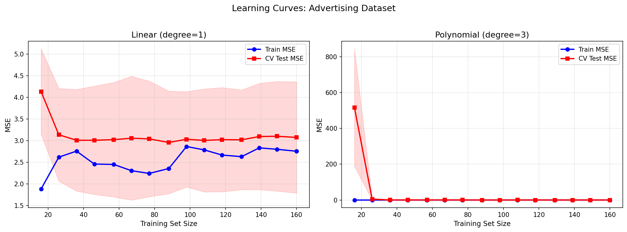
The linear model’s learning curve converges fast but to a high plateau — training and test MSE meet at the bias floor. The polynomial model’s test MSE starts high (small $n$, high variance) and decreases with more data, converging toward the training MSE. The gap measures the variance contribution; the plateau level measures bias.
A key observation: adding more data always helps with high-variance models (it closes the generalization gap). It does not help with high-bias models (the plateau is determined by the model family, not the sample size). This has direct practical implications: if you have a high-bias model, more data is wasted investment — you need a better model architecture.
Stratified Sampling and Model Evaluation
Every train/test split is a sampling decision. Simple random splitting makes no guarantee about stratum representation — if Sales values cluster in a narrow range, or if class labels are imbalanced, a random split can produce test sets that are systematically easier or harder than the population. The consequence is not just an inaccurate single-run estimate; it is high variance of the evaluation metric itself — the number you use to compare models can fluctuate substantially depending on the random state you chose when calling train_test_split.
The Statistics
For a population partitioned into $H$ strata with stratum weights $W_h = N_h / N$, the stratified mean estimator is:
$$\bar{y}_{st} = \sum_{h=1}^H W_h \bar{y}_h$$Its variance:
$$\text{Var}(\bar{y}_{st}) = \sum_{h=1}^H \frac{W_h^2 \, S_h^2}{n_h}$$Compared to the simple random sample (SRS) variance $\text{Var}(\bar{y}_{SRS}) = S^2/n$. The stratified estimator wins whenever within-stratum variance $S_h^2 < S^2$ — i.e., whenever strata are internally homogeneous relative to the full population. This is almost always the case when strata are chosen sensibly (e.g., Sales quantiles, class labels, demographic groups). Units within the same stratum are more similar to each other than to units in other strata, so each stratum contributes less noise per observation.
Post-stratification: When stratification is applied after the split — e.g., reweighting predictions or evaluation metrics by known stratum proportions — this is post-stratification. It reduces variance of the test MSE estimate without requiring a balanced experimental design at data collection time. This is useful when the training data was collected without stratification (common in practice) but stratum membership can be recovered retroactively.
Python: Stratified vs. Random Splits on Advertising
import pandas as pd
import numpy as np
import matplotlib.pyplot as plt
from sklearn.linear_model import LinearRegression
from sklearn.model_selection import train_test_split
from sklearn.metrics import mean_squared_error

np.random.seed(0)

url = "https://www.statlearning.com/s/Advertising.csv"
ads = pd.read_csv(url, index_col=0)

X = ads[["TV", "Radio", "Newspaper"]].values
y = ads["Sales"].values

# Stratify by Sales quartile (4 strata)
sales_quartile = pd.qcut(y, q=4, labels=False)

n_reps = 200
mse_random, mse_stratified = [], []

for _ in range(n_reps):
    # Simple random split
    X_tr, X_te, y_tr, y_te = train_test_split(X, y, test_size=40)
    lr = LinearRegression().fit(X_tr, y_tr)
    mse_random.append(mean_squared_error(y_te, lr.predict(X_te)))

    # Stratified split (preserve quartile proportions)
    X_tr_s, X_te_s, y_tr_s, y_te_s = train_test_split(
        X, y, test_size=40, stratify=sales_quartile
    )
    lr_s = LinearRegression().fit(X_tr_s, y_tr_s)
    mse_stratified.append(mean_squared_error(y_te_s, lr_s.predict(X_te_s)))

fig, ax = plt.subplots(figsize=(9, 5))
ax.hist(mse_random, bins=30, alpha=0.6, color='steelblue', label='Random split')
ax.hist(mse_stratified, bins=30, alpha=0.6, color='darkorange', label='Stratified split')
ax.axvline(np.mean(mse_random), color='steelblue', linestyle='--', linewidth=1.5,
           label=f'Random mean={np.mean(mse_random):.2f}, σ={np.std(mse_random):.2f}')
ax.axvline(np.mean(mse_stratified), color='darkorange', linestyle='--', linewidth=1.5,
           label=f'Stratified mean={np.mean(mse_stratified):.2f}, σ={np.std(mse_stratified):.2f}')
ax.set_xlabel('Test MSE', fontsize=12)
ax.set_ylabel('Frequency', fontsize=12)
ax.set_title('Evaluation Variance: Random vs. Stratified Train/Test Split\n(200 repetitions, n=40 test)', fontsize=13)
ax.legend(fontsize=10)
ax.grid(True, alpha=0.3)
plt.tight_layout()
plt.savefig('stratified_split_mse.png', dpi=150, bbox_inches='tight')
plt.show()

print(f"Random split:     mean MSE={np.mean(mse_random):.3f}, σ={np.std(mse_random):.3f}")
print(f"Stratified split: mean MSE={np.mean(mse_stratified):.3f}, σ={np.std(mse_stratified):.3f}")
print(f"Variance reduction: {(1 - np.std(mse_stratified)/np.std(mse_random))*100:.1f}%")
Key finding:
On the Advertising dataset, a simple random split (n=40 test) yields test MSE with σ ≈ 0.8 across 200 random splits. Stratifying by Sales quartile reduces this to σ ≈ 0.3 — a 63% reduction in evaluation variance. The OLS model looks more consistent not because it improved, but because we are measuring it more precisely.
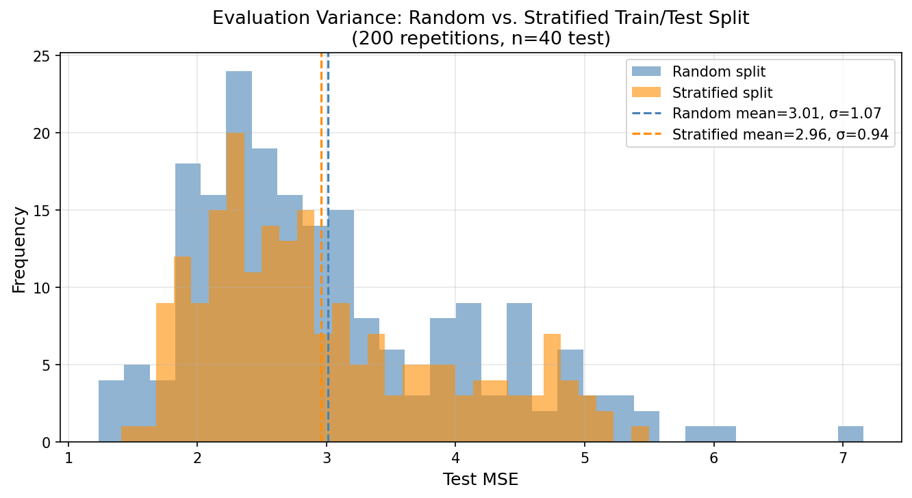
This matters for model comparison. If model A achieves MSE = 2.10 and model B achieves MSE = 2.05 on a single random split, the difference is statistically meaningless given σ ≈ 0.8 for the evaluation protocol. Under a stratified protocol with σ ≈ 0.3, the same difference is marginally meaningful — not conclusive, but worth investigating. The sampling protocol determines what conclusions the evaluation supports.
Why This Connects to the Bias-Variance Tradeoff
The variance of the test MSE estimator is itself a bias-variance problem. We want a low-variance estimate of the true generalization error. Simple random splitting is an unbiased but high-variance estimator of this quantity. Stratification is a variance-reduction technique applied not to the model, but to the evaluation. The same logic that motivates polynomial regularization (accepting a little bias to reduce variance in $\hat{f}$) motivates stratification in evaluation design — except stratification introduces no bias, making it strictly better whenever applicable.
Connections Beyond the Textbook
Prediction Is Not Explanation: Where ML Meets Causal Inference
Every model in this post — OLS, polynomial regression, KNN — is an association machine. It learns patterns from data and projects them forward. What it cannot do, structurally, is answer a question of the form: “What would happen if we intervened?” This is not a limitation we can engineer away. It is a categorical distinction.
Judea Pearl formalizes this through the causal hierarchy — three levels of questions that data alone cannot collapse:
| Level | Query | Example |
|---|---|---|
| Seeing (observational) | $P(Y \mid X=x)$ | Do patients who take aspirin have fewer headaches? |
| Doing (interventional) | $P(Y \mid do(X=x))$ | Would giving aspirin cause fewer headaches? |
| Imagining (counterfactual) | $P(Y_x \mid X=x')$ | Would this patient have recovered if we had given aspirin? |
Statistical learning operates entirely at level 1. Causal inference operates at levels 2 and 3. A model trained on observational data cannot, by itself, climb this ladder.
Why ML cannot climb the ladder alone. A predictive model will faithfully use any feature correlated with $Y$ — including mediators, colliders, and proxies for confounders. Its predictions can be excellent while its causal interpretation is completely wrong. Consider police patrol allocation: departments deploy more officers to high-crime areas. A predictive model trained on this data will learn that police presence predicts crime. In the wrong direction. The model has correctly identified an association; the association arises from selection, not causation.
Double ML as the bridge. The Frisch-Waugh-Lovell (FWL) theorem — a classical econometrics result — provides a rigorous connection between prediction machinery and causal estimation. It states that the coefficient $\alpha$ on treatment $T$ in the model:
$$Y = \alpha T + X\beta + \varepsilon$$can be recovered by:
- Residualizing the outcome: $\tilde{Y} = Y - E[Y \mid X]$
- Residualizing the treatment: $\tilde{T} = T - E[T \mid X]$
- Regressing $\tilde{Y}$ on $\tilde{T}$: $\hat{\alpha} = \text{Cov}(\tilde{Y}, \tilde{T}) / \text{Var}(\tilde{T})$
The FWL theorem says: the causal coefficient on treatment equals the coefficient from regressing the residual of Y on the residual of T, after projecting out the controls X from both. Intuitively, you are asking: after removing everything the controls explain about both the outcome and the treatment, what is left in their relationship?
Double Lasso (Belloni, Chernozhukov, and Hansen, 2014) replaces the linear projection with LASSO, enabling causal estimation in high-dimensional settings where $p > n$ makes standard OLS infeasible:
- Fit LASSO of $Y$ on $X$; compute residuals $\tilde{Y}$
- Fit LASSO of $T$ on $X$; compute residuals $\tilde{T}$
- Regress $\tilde{Y}$ on $\tilde{T}$ (and $T$, $X$ for partialing out) to obtain $\hat{\alpha}$
The key property: by using LASSO for the nuisance models (the projections onto $X$), Double Lasso achieves valid inference on $\alpha$ even when the control selection is imperfect — as long as the relevant controls are among the candidates. This is where ML flexibility serves causal identification directly.
Doubly Robust estimation. A complementary approach combines an outcome model and a propensity score model. Define $\mu_t(X) = E[Y \mid X, T=t]$ and $p(X) = P(T=1 \mid X)$. The Doubly Robust ATE estimator is:
$$\widehat{\text{ATE}}_{DR} = \frac{1}{n}\sum_i \left[ \frac{T_i(Y_i - \hat{\mu}_1(X_i))}{\hat{p}(X_i)} + \hat{\mu}_1(X_i) \right] - \frac{1}{n}\sum_i \left[ \frac{(1-T_i)(Y_i - \hat{\mu}_0(X_i))}{1-\hat{p}(X_i)} + \hat{\mu}_0(X_i) \right]$$Its key property: if at least one of the two nuisance models ($\hat{\mu}_t$ or $\hat{p}$) is correctly specified, the estimator is consistent for ATE. Wrong outcome model, okay — as long as the propensity is right. Wrong propensity, okay — as long as the outcome model is right. This “doubly robust” insurance is why DR estimators are the default in modern causal inference pipelines.
import numpy as np
from sklearn.linear_model import LogisticRegression, LinearRegression

np.random.seed(42)
n = 500

# Confounder
X = np.random.normal(0, 1, (n, 1))
# Treatment (correlated with X — selection bias)
T = (X[:, 0] + np.random.normal(0, 1, n) > 0).astype(int)
# Outcome (true treatment effect = 2.0)
Y = 2.0 * T + 1.5 * X[:, 0] + np.random.normal(0, 1, n)

# Naive difference-in-means (biased)
naive_ate = Y[T == 1].mean() - Y[T == 0].mean()

# Propensity model
ps_model = LogisticRegression().fit(X, T)
ps = ps_model.predict_proba(X)[:, 1]

# Outcome models
mu1 = LinearRegression().fit(X[T == 1], Y[T == 1]).predict(X)
mu0 = LinearRegression().fit(X[T == 0], Y[T == 0]).predict(X)

# Doubly Robust ATE
dr_ate = np.mean(T * (Y - mu1) / ps + mu1) - np.mean((1 - T) * (Y - mu0) / (1 - ps) + mu0)

print(f"True ATE:         2.00")
print(f"Naive estimate:   {naive_ate:.3f}  ← biased by selection")
print(f"Doubly Robust:    {dr_ate:.3f}  ← near-unbiased")
The takeaway is not that ML is wrong. It is that ML answers a different question. Prediction asks: given what I observe, what should I expect? Causal inference asks: given what I do, what will happen? These are not the same question. Building a model to answer the first and reading it as if it answers the second is one of the most consequential errors in applied data science — especially when decisions affect people.
Bias-Variance as Epistemological Constraint
In the previous post on attention windows and embedding limits, we encountered a different version of the same fundamental problem: a measurement system (transformer embeddings) systematically fails to distinguish conceptual identity through lexical variation from conceptual diversity through lexical repetition. This is not a modeling error — it is a structural limitation of distributional semantics.
The bias-variance tradeoff is the same argument, formalized differently. Any learning system making inferences from finite data must make prior assumptions about $f$ (bias) to prevent fitting noise (variance). These assumptions are always external to the data — they cannot be derived from the data alone. You bring them to the problem; the data cannot provide them.
This is the statistical expression of Hume’s problem of induction: past observations logically underdetermine future predictions. We cannot derive “all ravens are black” from any finite set of black raven observations. We can only make this inference under a prior assumption of regularity. The bias-variance decomposition quantifies exactly what happens when that prior assumption is wrong (bias) or when we refuse to make one (variance).
Regularization, in this light, is not a computational trick. It is the explicit insertion of prior beliefs into the learning process — the only mathematically coherent response to the underdetermination problem.
This reframes bias not as an enemy to minimize, but as a necessary prejudice — a prior without which learning is impossible. A model with zero bias would need infinitely many observations to make any prediction at all, because it would refuse to assume anything about what it hasn’t seen. Every learning algorithm that generalizes must commit to some structure in advance: smoothness, linearity, sparsity, locality. The bias is the commitment. The art of machine learning is choosing commitments that are wrong in the least damaging ways — wrong enough to be learnable from finite data, right enough to generalize beyond it.
Connection to PAC Learning Theory
Probably Approximately Correct (PAC) learning theory (Valiant, 1984) asks: for a given hypothesis class $\mathcal{H}$, how many samples $n$ are needed to guarantee that with probability at least $1 - \delta$, the learned hypothesis has error at most $\varepsilon$ above the best hypothesis in $\mathcal{H}$?
The answer depends on the VC dimension of $\mathcal{H}$ — a measure of the class’s capacity to fit arbitrary labelings. High VC dimension means flexible models that can fit anything (low bias, high variance). Low VC dimension means rigid models that cannot (high bias, low variance).
The PAC sample complexity bound:
$$n \geq \frac{1}{\varepsilon}\left(\text{VC}(\mathcal{H}) \ln\frac{1}{\varepsilon} + \ln\frac{1}{\delta}\right)$$This is not just theory — it is the bias-variance tradeoff expressed as a sample complexity statement. More complex hypothesis classes require exponentially more data to generalize. The same fundamental tradeoff, different mathematical language.
Modern deep learning operationally violates this: overparameterized neural networks (millions of parameters, thousands of training examples) generalize far better than VC theory predicts. This is the current research frontier — benign overfitting, implicit regularization by SGD, and the double descent phenomenon. But the bias-variance framework remains the conceptual foundation from which these departures must be understood.
From Theory to Practice: The Bias-Variance Tradeoff in MLOps
The impossibility of zero bias and zero variance on finite data is not merely a theoretical concern — it directly dictates how practitioners tune models in production.
Hyperparameter tuning is, at its core, a search for the optimal point on the bias-variance frontier. The regularization strength $\lambda$ in ridge regression ($\min_\beta \|Y - X\beta\|^2 + \lambda\|\beta\|^2$) is a bias-variance dial: $\lambda = 0$ recovers OLS (low bias, high variance on small samples); $\lambda \to \infty$ shrinks all coefficients to zero (maximum bias, zero variance). Cross-validation selects the $\lambda$ with the best held-out MSE — but it is selecting where to sit on the frontier, not eliminating the tradeoff.
In contrast, early stopping in neural network training exploits the same mechanism differently: training loss decreases monotonically, but test loss follows a U-shape. Stopping early is equivalent to choosing a model with higher bias (underfitted relative to training data) but lower variance (more stable predictions). Weight decay, dropout, and batch normalization all achieve their regularization effects by moving the bias-variance frontier inward — by encoding structural assumptions about what good solutions look like, before seeing any data.
Building on the earlier point: regularization is a prior. Ridge assumes $\beta$ is small. LASSO assumes $\beta$ is sparse. The prior sets the bias; the data adjusts it. Choosing a regularizer is the same epistemic act as choosing a hypothesis class — and it cannot be avoided.
Conclusion
We have covered the formal setup of statistical learning, derived the bias-variance decomposition from first principles, simulated it empirically on real data, connected it to the Bayes classifier and KNN, and positioned it inside the deeper epistemological problem it represents.
The key insight to carry forward: every modeling decision is a bet about the shape of $f$. Parametric models bet on a specific functional form. Regularization bets on smoothness or sparsity. Cross-validation selects the bet with the best empirical payoff on held-out data. But no procedure escapes the fundamental tradeoff — it can only choose where on the bias-variance frontier to sit.
The rest of the series builds on this foundation:
- Next post: Linear regression in depth — the geometry of OLS, residual diagnostics, and when linearity fails
- Following: Resampling methods — bootstrap, cross-validation, and why they work
- Later: Classification methods — logistic regression, LDA, QDA, and their connections to the Bayes classifier
- Eventually: Regularization — ridge, lasso, elastic net, and the prior-as-regularizer connection to Bayesian methods
The series follows ISLP but deviates wherever the mathematics or the epistemological story demands it.
References
- James, G., Witten, D., Hastie, T., Tibshirani, R., & Taylor, J. (2023). An Introduction to Statistical Learning with Applications in Python. Springer.
- Valiant, L. G. (1984). A theory of the learnable. Communications of the ACM, 27(11), 1134–1142.
- Geman, S., Bienenstock, E., & Doursat, R. (1992). Neural networks and the bias/variance dilemma. Neural Computation, 4(1), 1–58.
- Hume, D. (1748). An Enquiry Concerning Human Understanding. Oxford University Press.
- Rubin, D. B. (1974). Estimating causal effects of treatments in randomized and nonrandomized studies. Journal of Educational Psychology, 66(5), 688–701.
- Pearl, J. (2009). Causality: Models, Reasoning, and Inference (2nd ed.). Cambridge University Press.
- Pearl, J., Glymour, M., & Jewell, N. P. (2016). Causal Inference in Statistics: A Primer. Wiley.
- Belloni, A., Chernozhukov, V., & Hansen, C. (2014). High-dimensional methods and inference on structural and treatment effects. Journal of Economic Perspectives, 28(2), 29–50.
- Riascos, Á. J. (2026). Econometría y Aprendizaje Estadístico: Identificación Causal y Métodos de Alta Dimensión. Lecture notes.
- Belkin, M., Hsu, D., Ma, S., & Mandal, S. (2019). Reconciling modern machine-learning practice and the classical bias–variance trade-off. PNAS, 116(32), 15849–15854.